
Institutional Retirement Investment Center (iRIC) Redesign
2024
The Challenge
Bank of America’s institutional retirement reporting platform (iRIC) faced a decade of design debt, leading to advisor frustration, a high risk of churn, and approximately $5 billion in annual asset management fees at stake. I had to lead a complete UX overhaul with a "zero new-backend" constraint; every improvement had to be achieved through IA and interaction design alone.
Revised IA and interaction design are relatively straight forward, though. The REAL challenge was establishing trust with a stakeholder unfamiliar with design projects and working with designers. There was a clear opportunity to over-deliver on the client’s original ask and cement the value of design as an integral component of successful products – even internal tools.
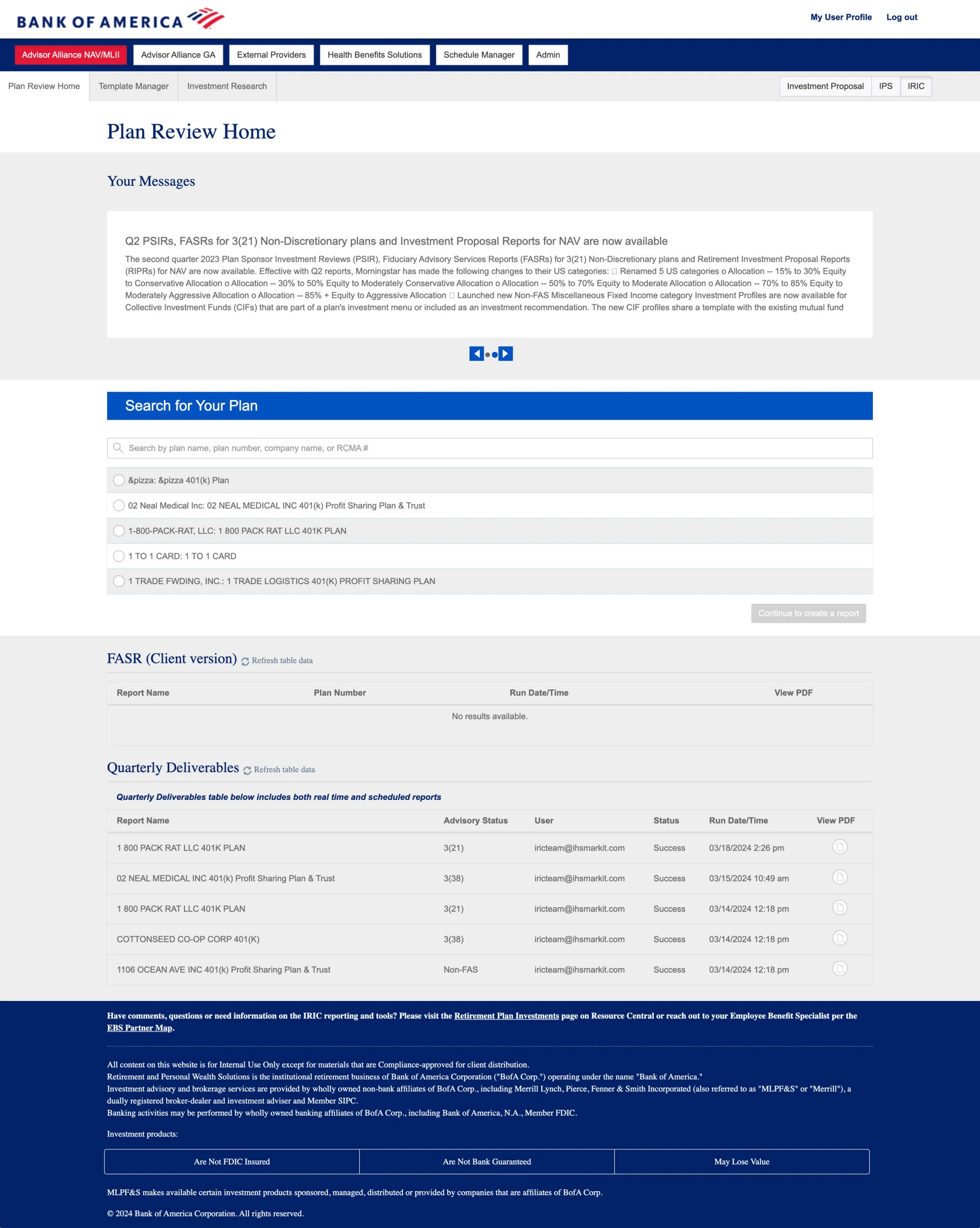
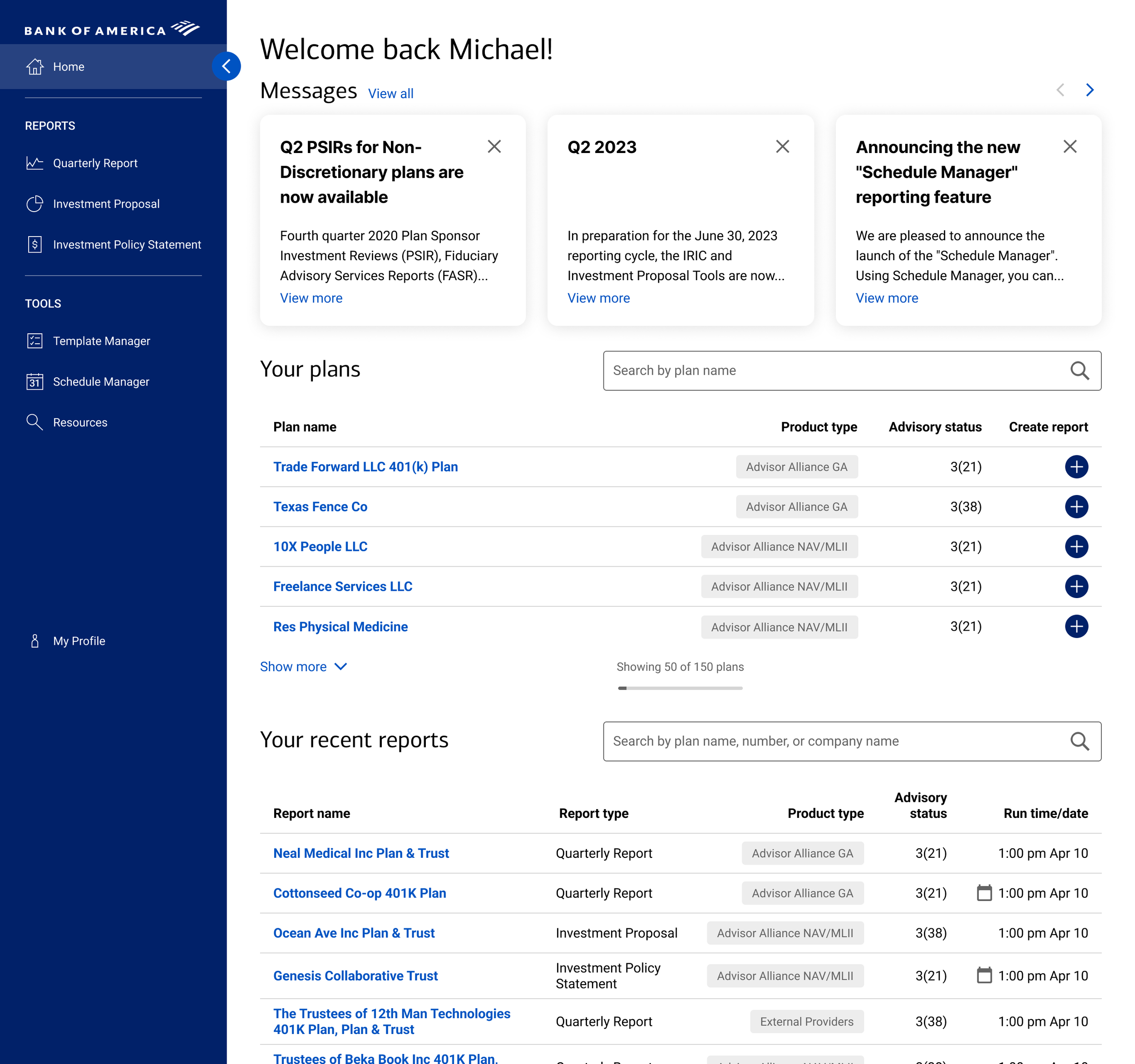
The navigation had become so convoluted, the long-tenured product owner got confused while giving a demo in the project kickoff.
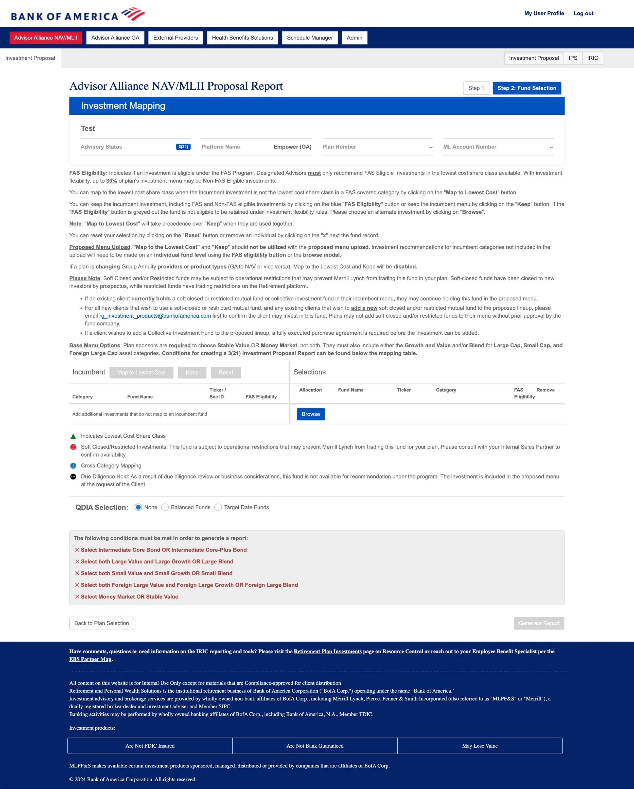
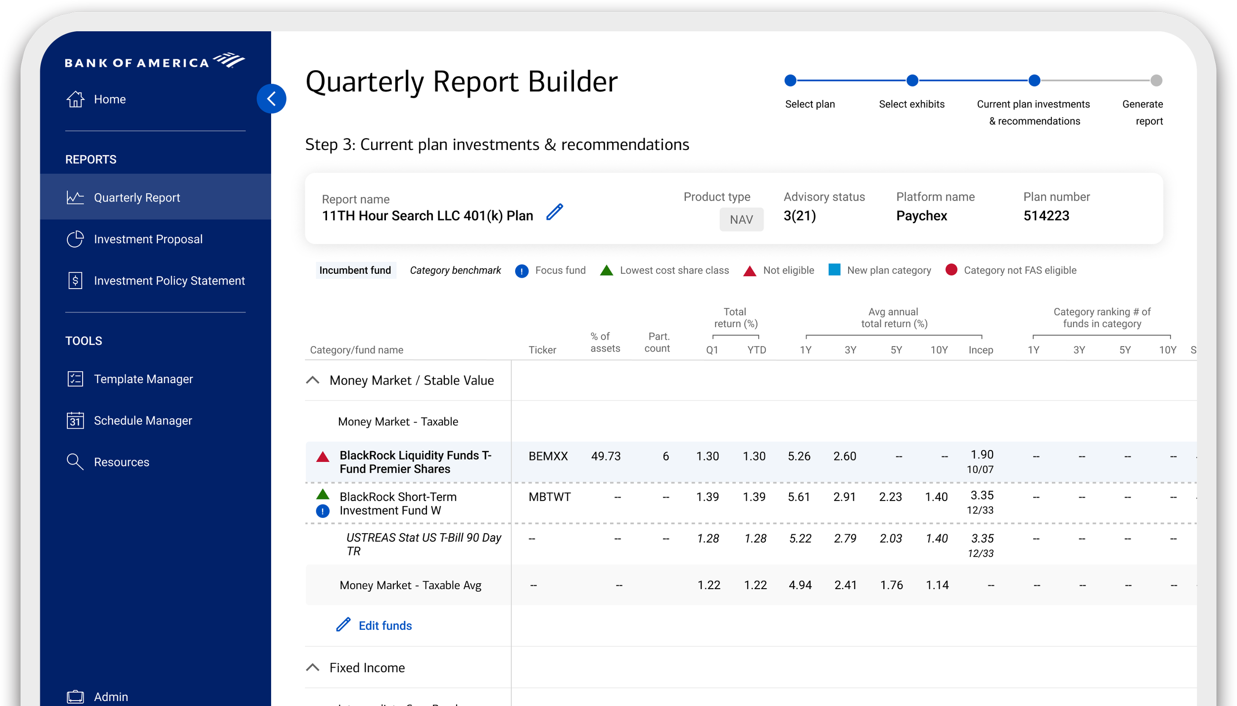
Systematic thinking had been overlooked amidst a regular cadence of feature enhancements. Key functionality for daily power users was pushed below the fold by a lengthy explanation of how to use that functionality.
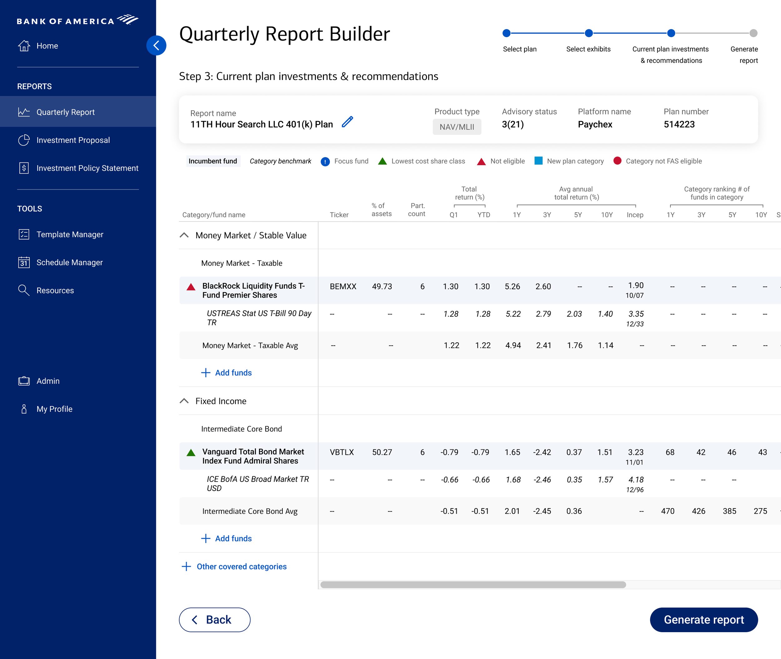
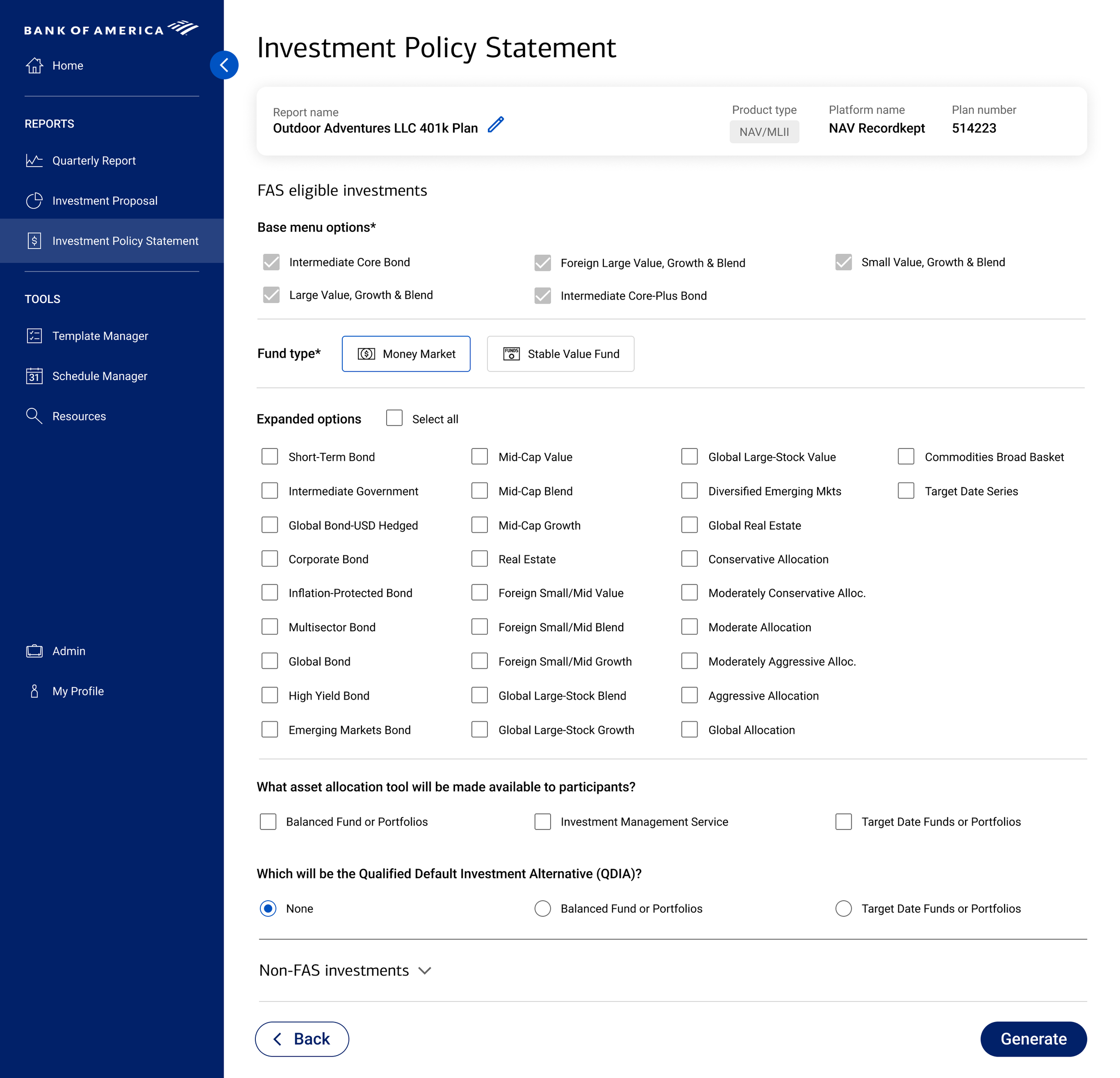
Data availability had been improved over the years, but the interface didn’t reflect those improvements. Users were regularly running full reports in order to view the data they needed to make decisions for those very reports.
My Role
I staffed, mentored, and directed a team of two junior designers, focusing on their professional growth through complex IA challenges, user research, and usability testing sessions, while simultaneously managing four additional designers across other workstreams. I introduced User-Centered Design practices to the product, and served as the primary bridge between executive leadership and engineering.
Strategy
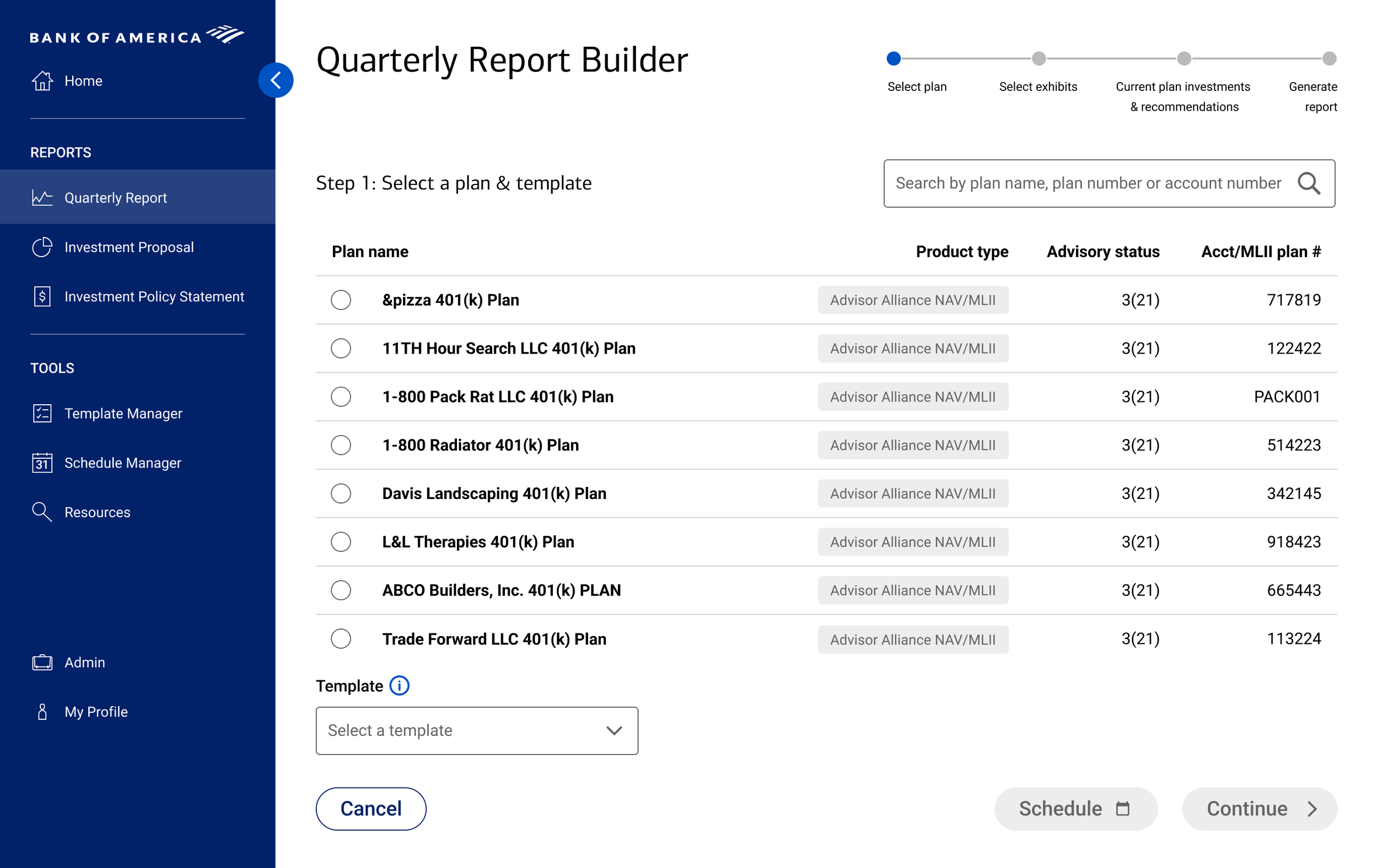
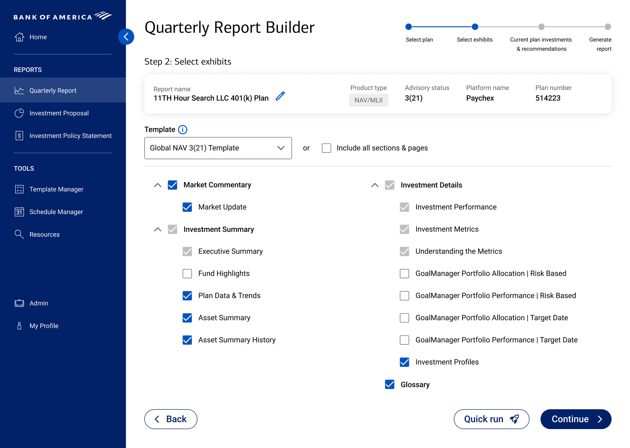
We prioritized Information Architecture and workflow optimization. By mapping research insights to existing API capabilities, we aligned navigational structure to users’ mental models and surfaced critical decision-making data without requiring backend changes. While not required, we leveraged the consumer-facing design system for efficiency and to improve the likelihood of executive buy-in. A round of user testing validated our decisions and allowed for our users to feel involved in – and therefore invested in the success of – the redesign of the platform.
Insights
User Research provided immediate value and offered numerous key insights that we were able to map to strategic design choices to mitigate product risk.
| User Insight | Product Risk | Strategic Design Action |
|---|---|---|
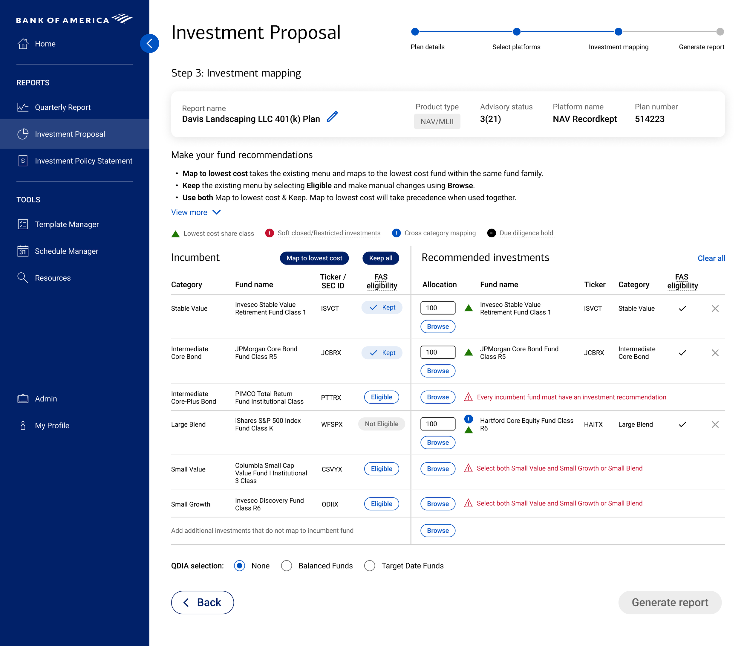
| Navigation Breakdowns Users completed complex workflows in the wrong sections, requiring total rework. |
Operational Inefficiency High support overhead and wasted advisor time. |
Taxonomy Realignment Renamed and regrouped primary navigation to match mental models rather than legacy database schemas. |
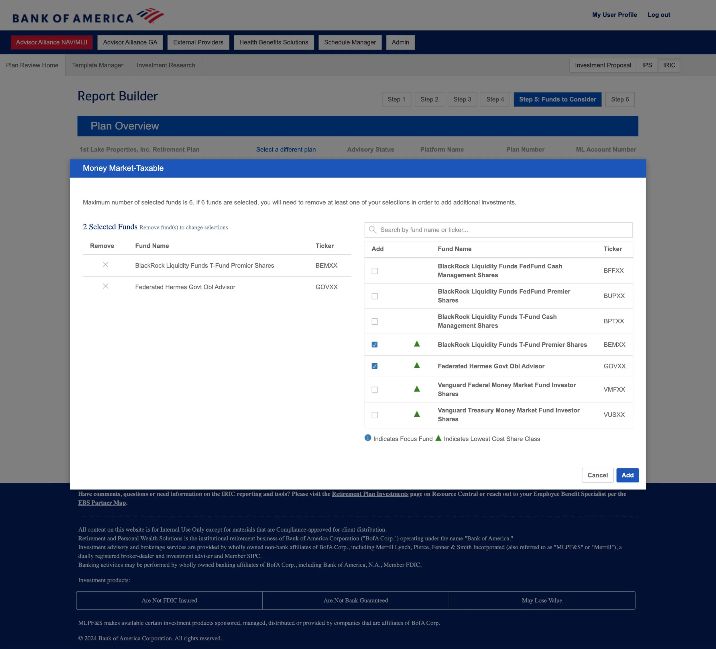
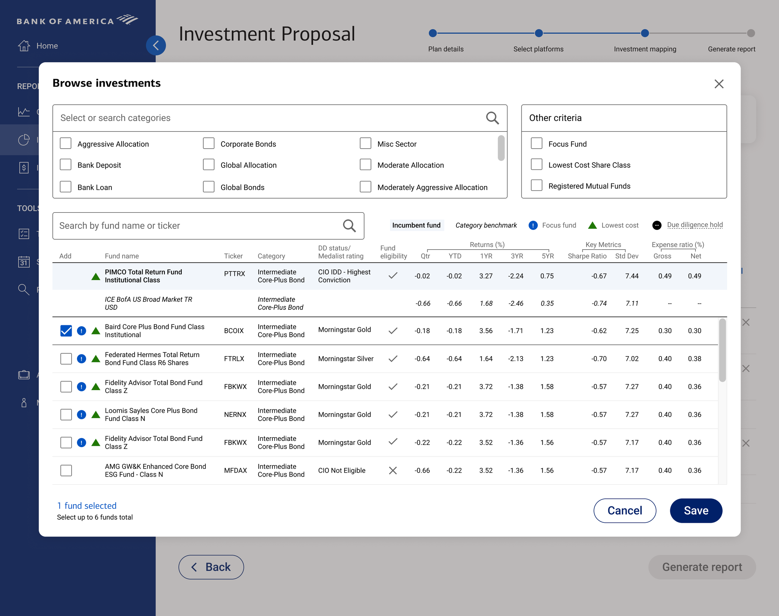
| Discoverability Gap ~50% of users were unaware of recently released, high-value features. |
Low ROI on Engineering Thousands of hours spent on features that provided zero realized value. |
Contextual Surfacing Moved key feature triggers into the reworked primary navigation instead of burying them in sub-menus. |
| Density > Aesthetics Power users demanded high data density and minimal scrolling over "white space." |
Product Rejection A "pretty" but sparse UI would only frustrate users in a different way rather than meeting their unique needs. |
Information Density Optimization Leveraged Gestalt principles to maintain clarity and manageable cognitive load while reducing negative space. |
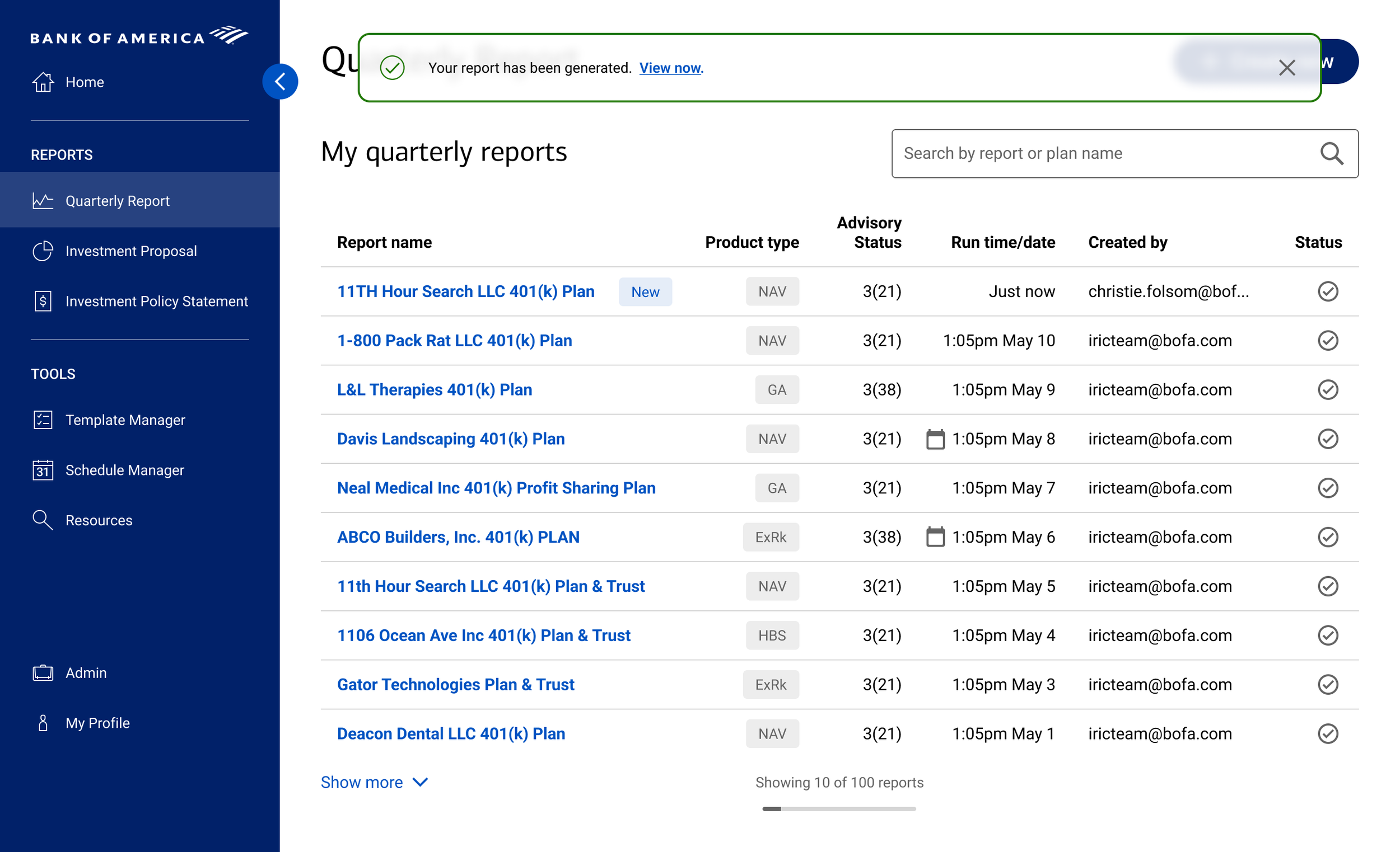
| Trust Deficit Destructive actions (deletions/submissions) lacked confirmation or feedback loops. |
Data Integrity Risk Increased risk of irreversible errors in retirement plan management. |
Interaction Guardrails Introduced systematic confirmation patterns and status messaging using existing frontend logic. |
The Goods

“This is much more streamlined than the past. Miles better. Great Improvement. A+!”
— Michael, Bank of America FA
What’s that you say? Unimpressed by static comps, are you? Wondering where those “Rapid Prototyping” skills are hiding? Well you see, Bank of America had a very restrictive firewall in 2024. So restrictive, in fact, that they couldn’t even visit figma.com – much less open a Figma prototype link. What was a design team to do? Build the prototypes in InVision, that’s what! The same InVision that…no longer exists.
How’s a guy to showcase his prototyping chops then? Well, I could rebuild the prototype in Figma. But that is SO 2024! Why not take the opportunity to explore the potential and pitfalls of AI assisted prototyping?
Here is my ongoing exploration of prototyping via Figma Make with Claude & Gemini. I’m not doing functional releases here, so who knows what you’ll get on any given day! I might have found a great stopping point the night before, or everything might have completely fallen to pieces with one innocuous prompt. Enjoy!
Password: Pointless?
Impact

Retention
Successfully mitigated advisor defection risk with 0 churn attributed to tooling post-launch.

Trust
The product owner – and her executive chain of command – were so pleased with the engagement and results that they asked us to present to BofA’s C-suite review committee.

Efficiency
Improved platform efficiency significantly by restructuring the primary workflow to align with advisor mental models rather than legacy internal labeling, as measured by successful task completion in usability testing and qualitative feedback.